GYG's training team oversees culinary and operational training across corporate and franchise restaurants nationally. Their existing online modules were trying to teach everything — including the hands-on how — which left floor training feeling repetitive and reduced its impact.
My role was to redesign the online training experience to complement, rather than replace, hands-on learning. The guiding principle became a clear division of purpose: online training would own the what and the why — the knowledge, context, and reasoning behind each task — while hands-on training would own the how.
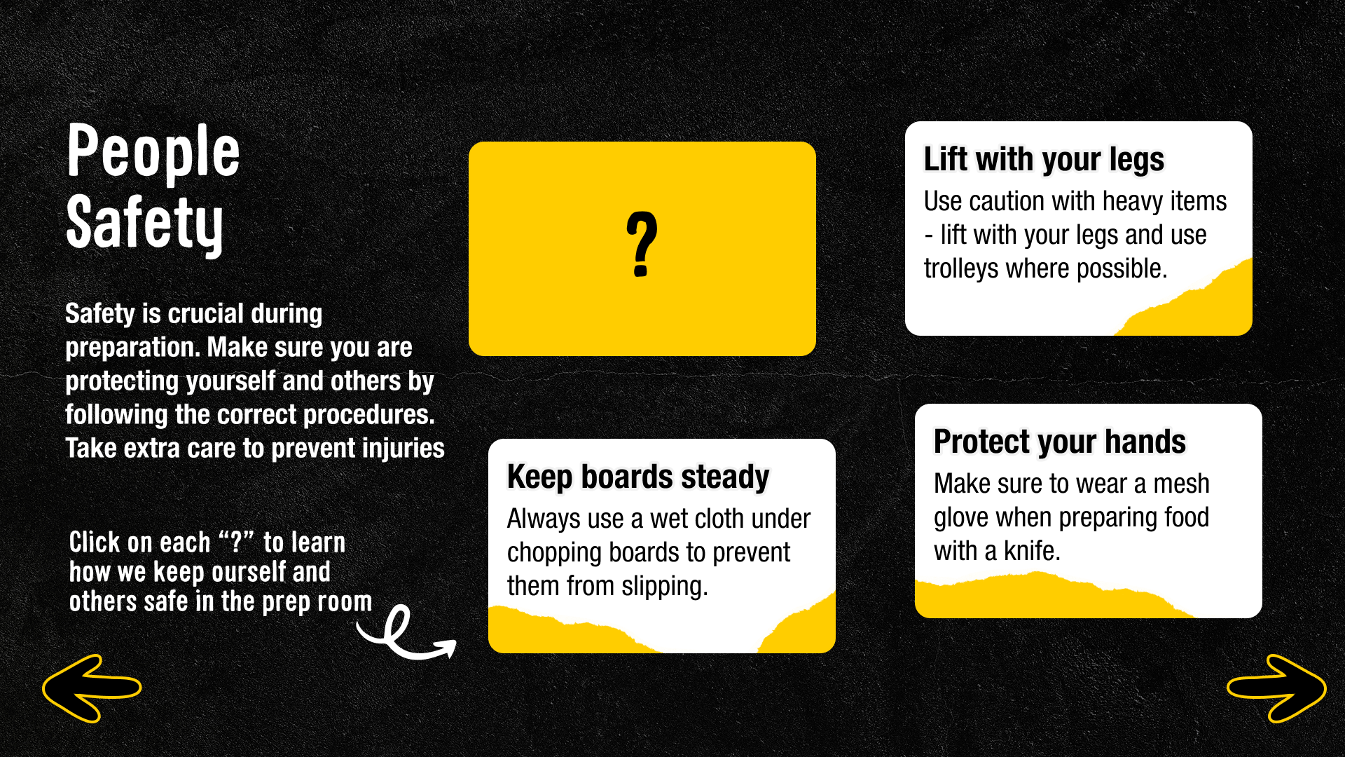
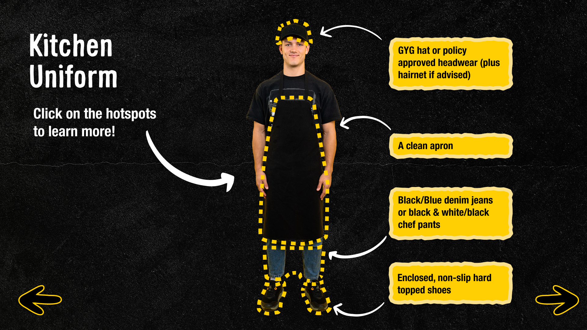
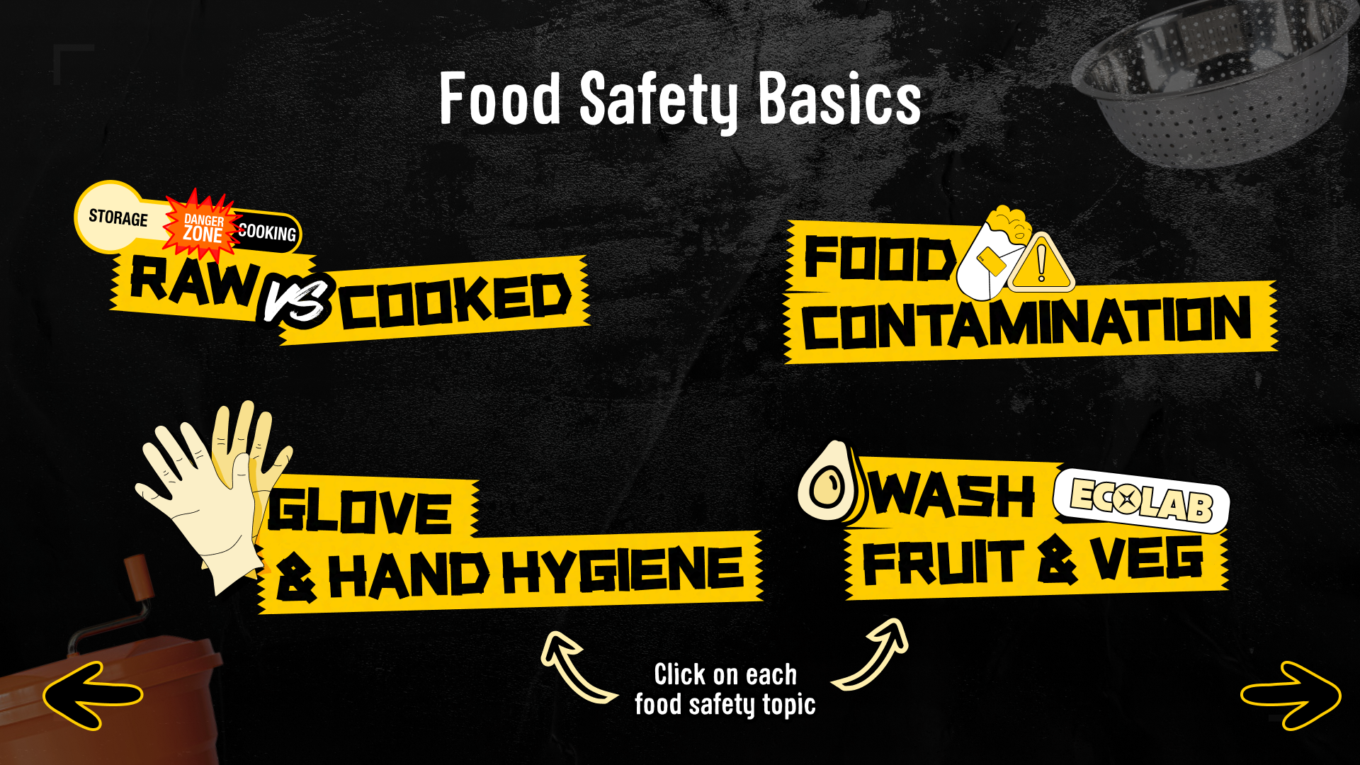
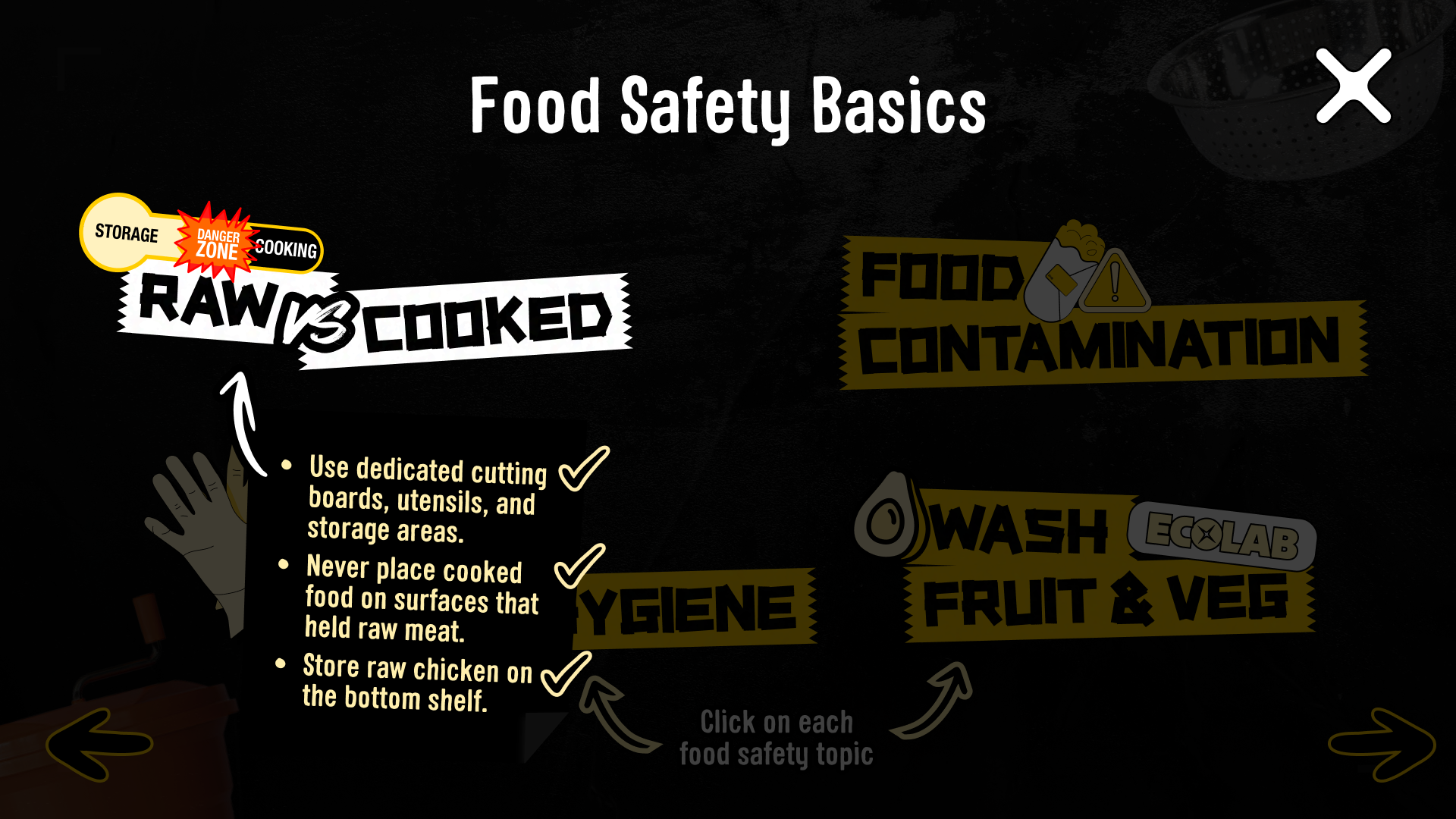
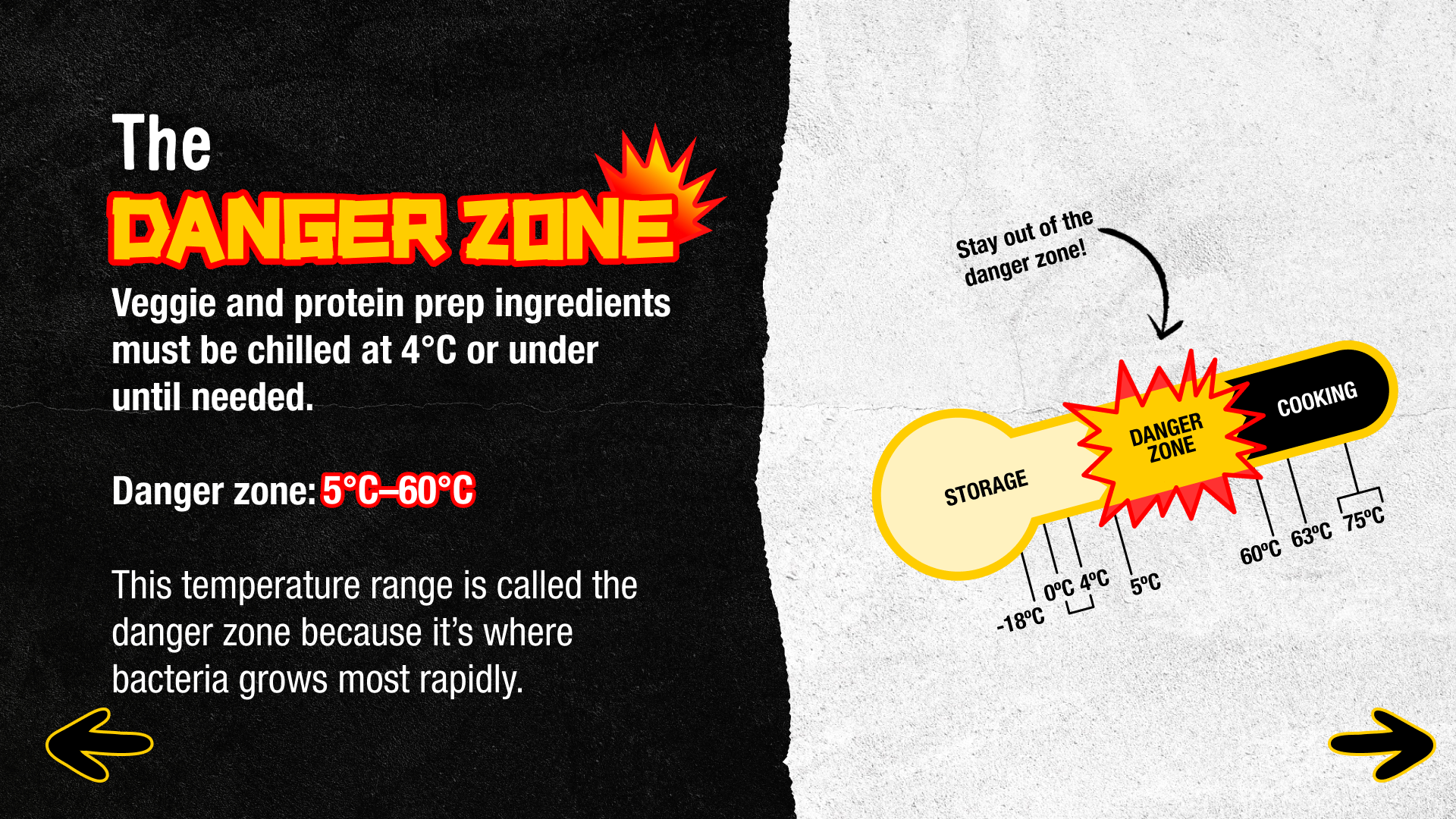
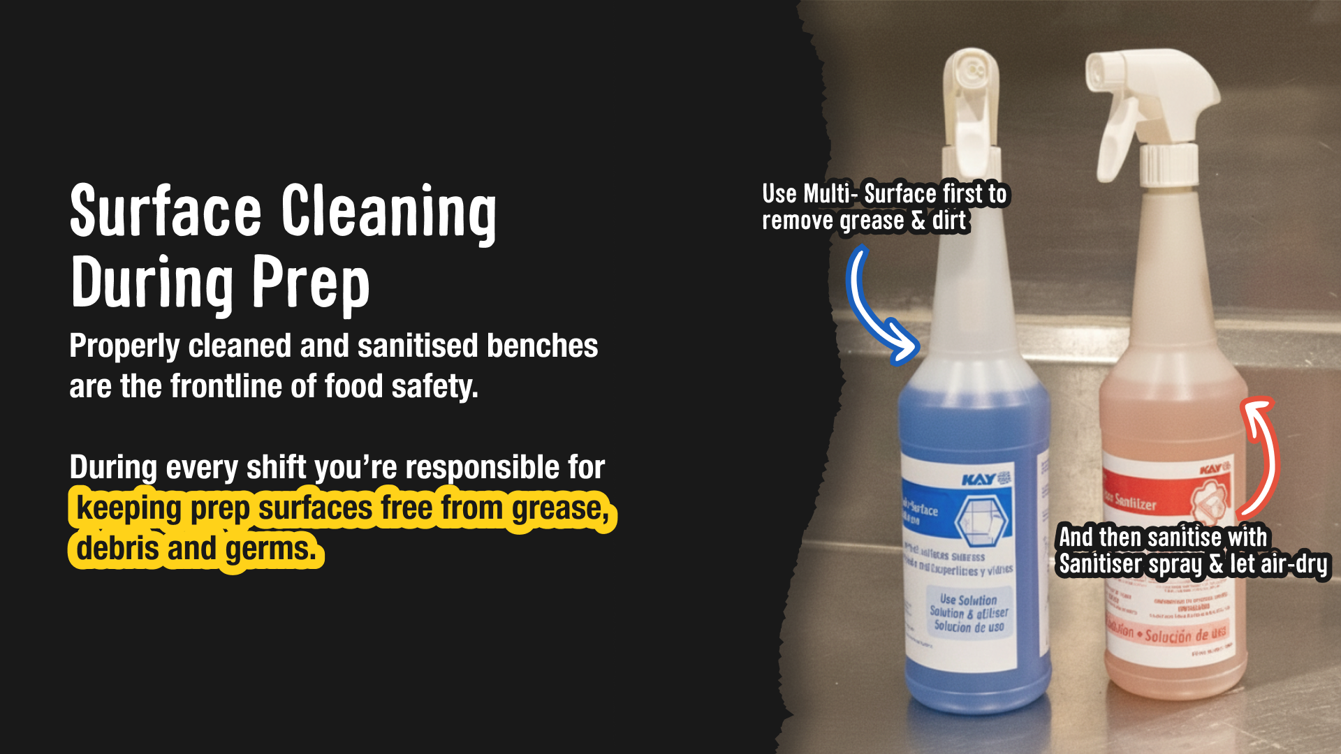
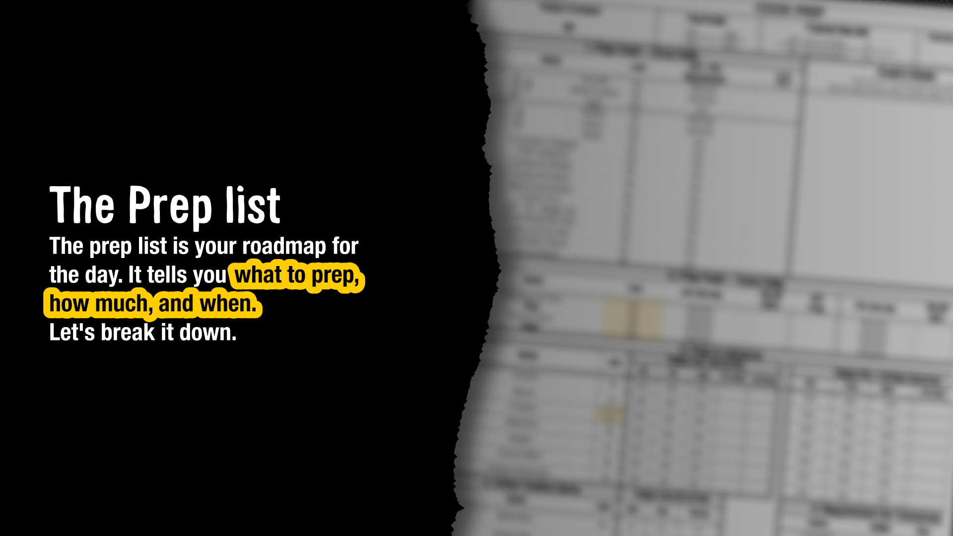
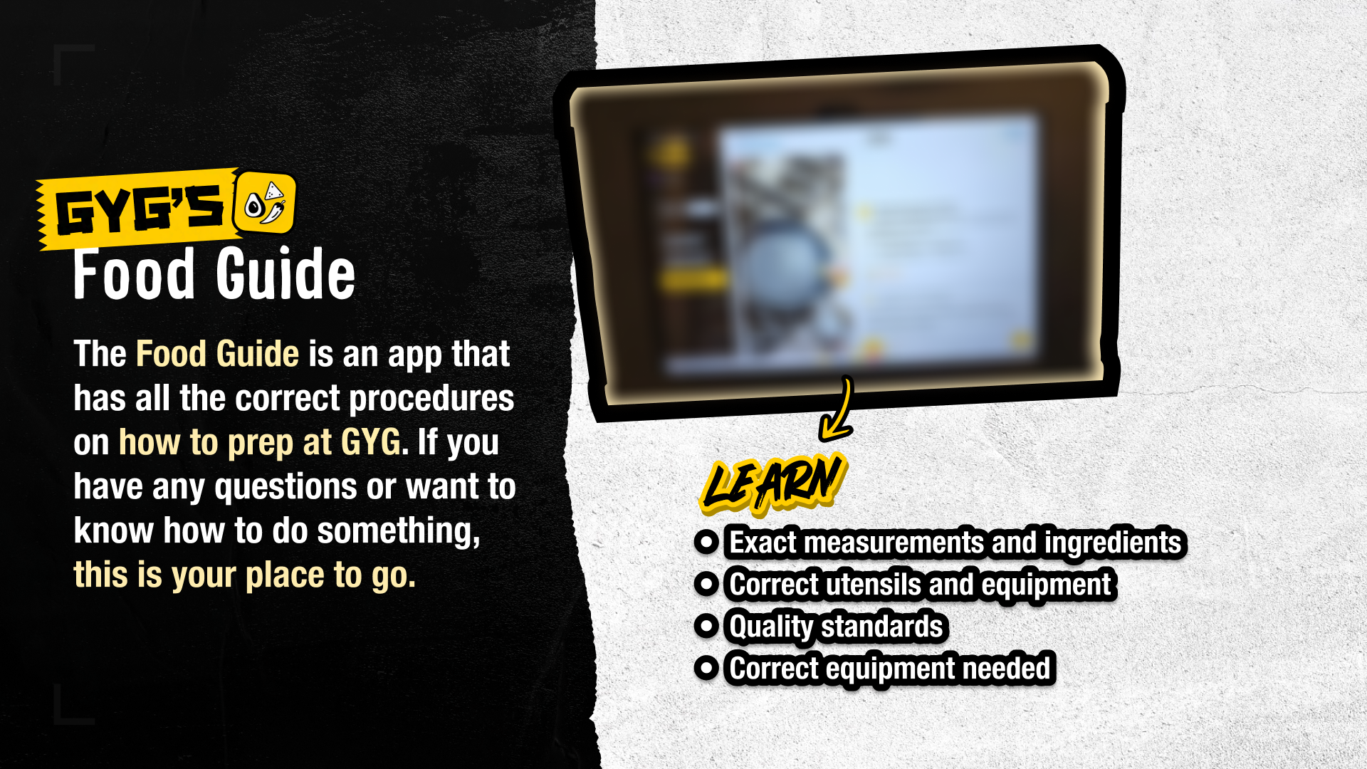
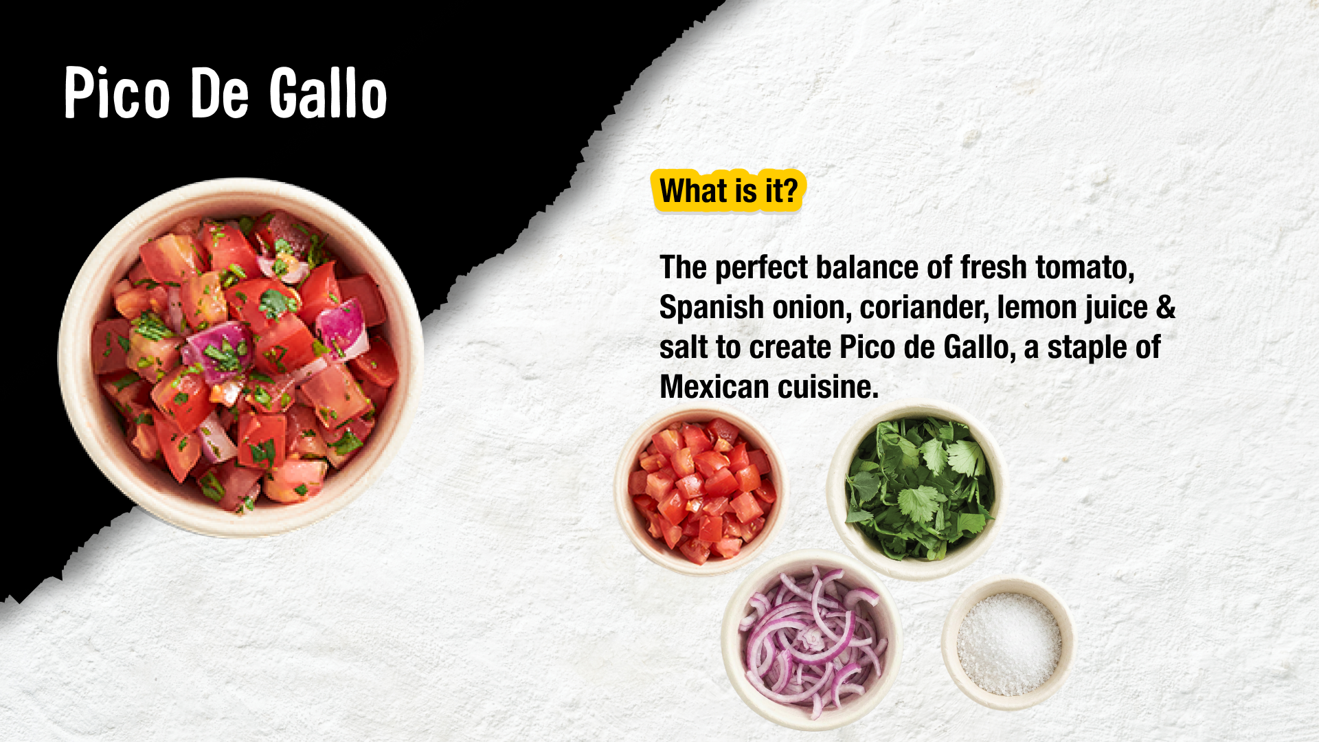
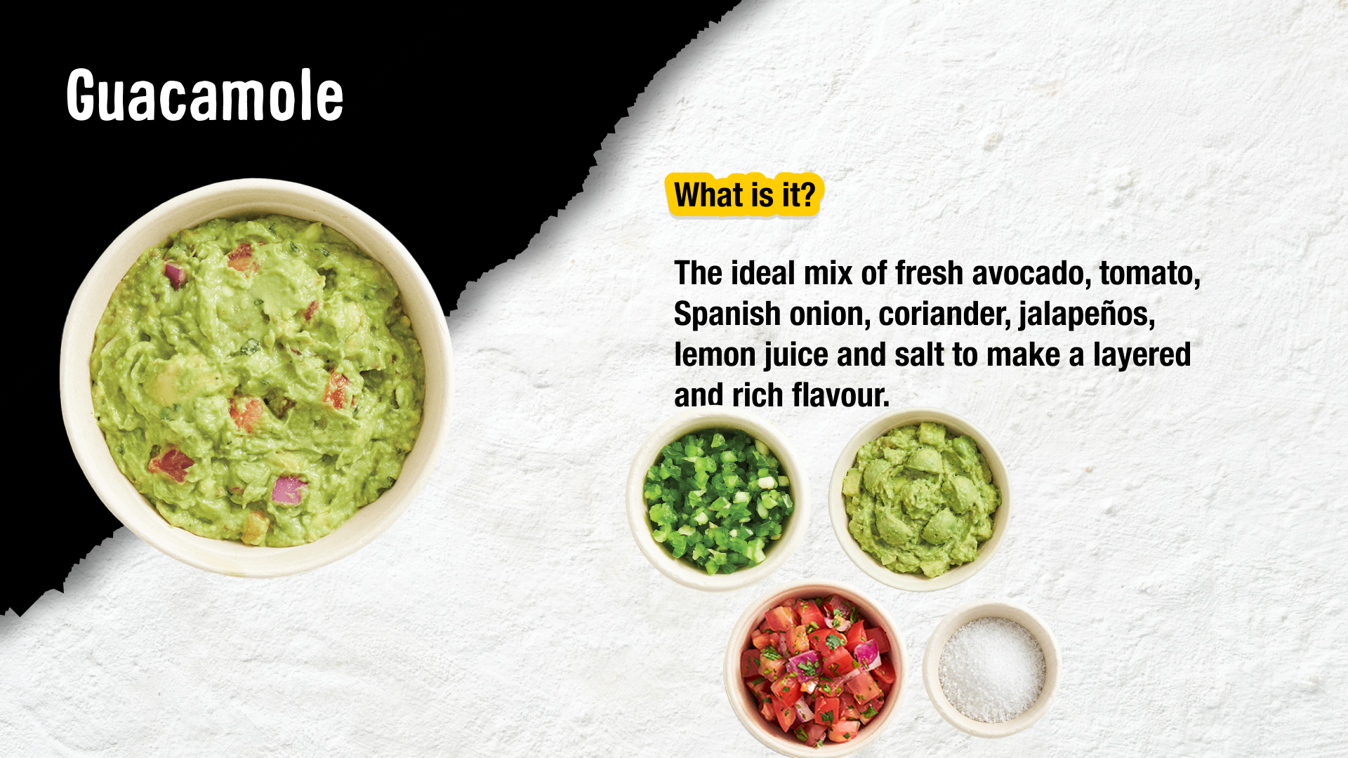
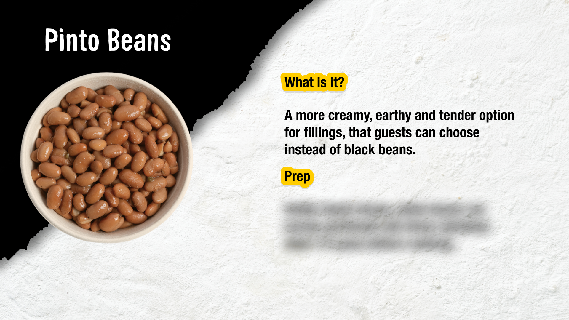
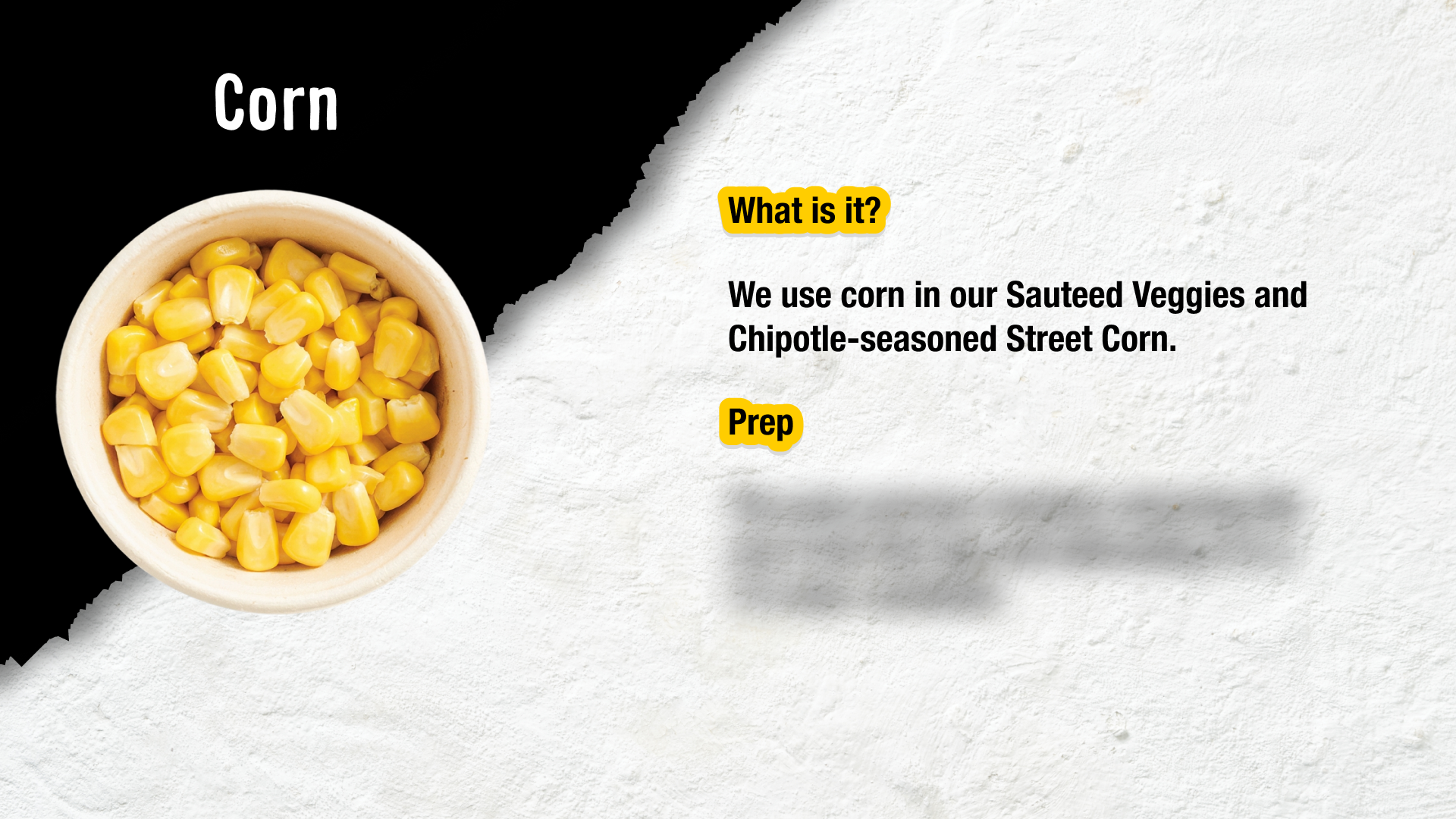
I designed two module sets to support this: a Prep series and a Cook series. Each module was built to be memorable and confidence-building — covering things like safe chicken cooking temperatures and ingredient knowledge — so that when crew members stepped onto the floor, they already had the context to make hands-on training click.
Some screens have been omitted or obscured to respect confidentiality agreeents with the client. The work shown is representative of the design process and outcomes.
Client
GYG Training Team
Scope
Prep modules (lead)
Full set refinement (Iteration 2)
My roles
Deliverables
8 Training e-modules
UX & Content Designer
1 co-designer (Cook Modules)
Collaborators
Overview
The visual design was guided by GYG's brand book, ensuring consistency with the look and feel crews already recognised in-restaurant. This meant leaning into the brand's bold colour palette, textured imagery, and the warm, playful tone of voice that runs through GYG's broader communications.
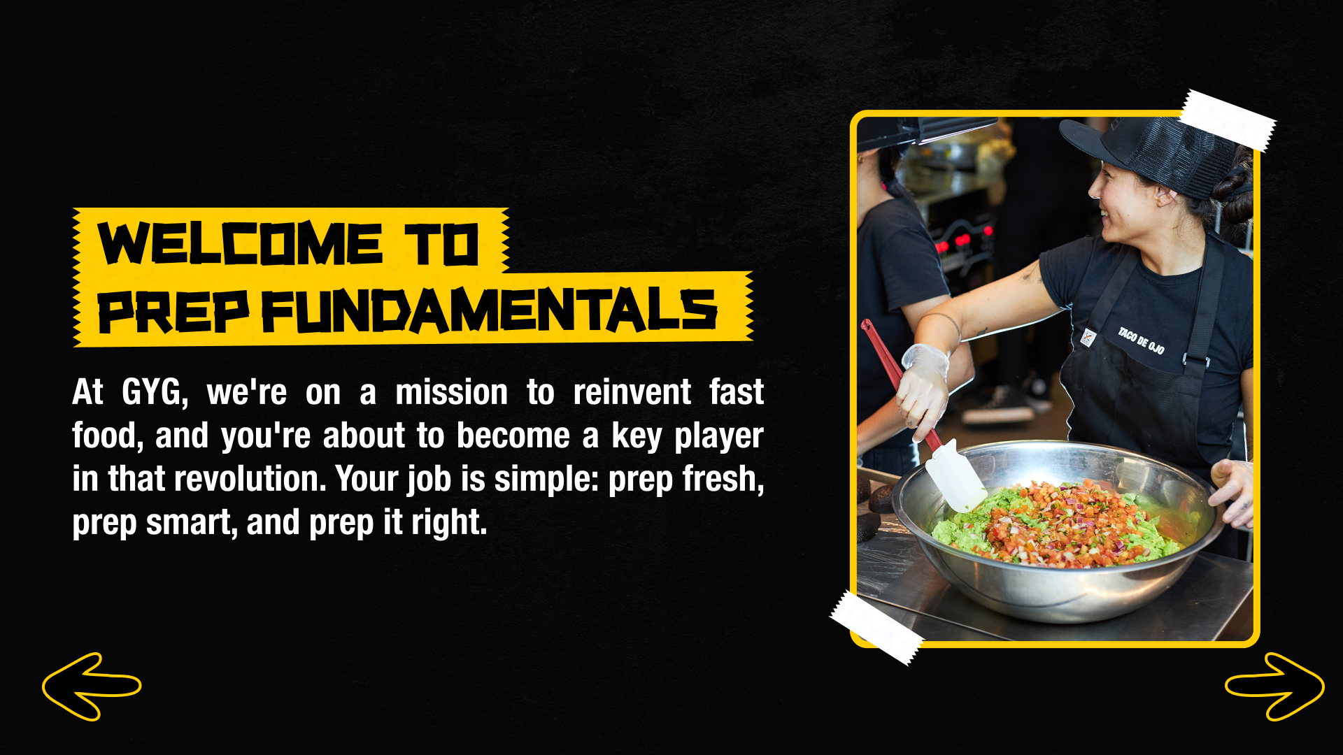
Prep Fundamentals
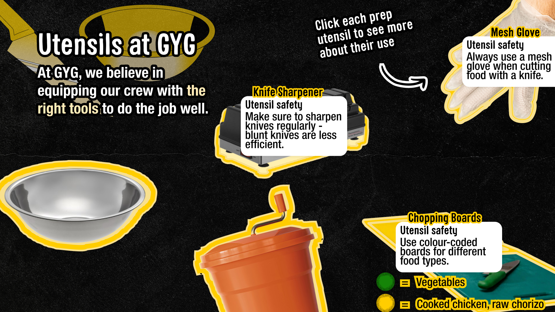
Prep Tools
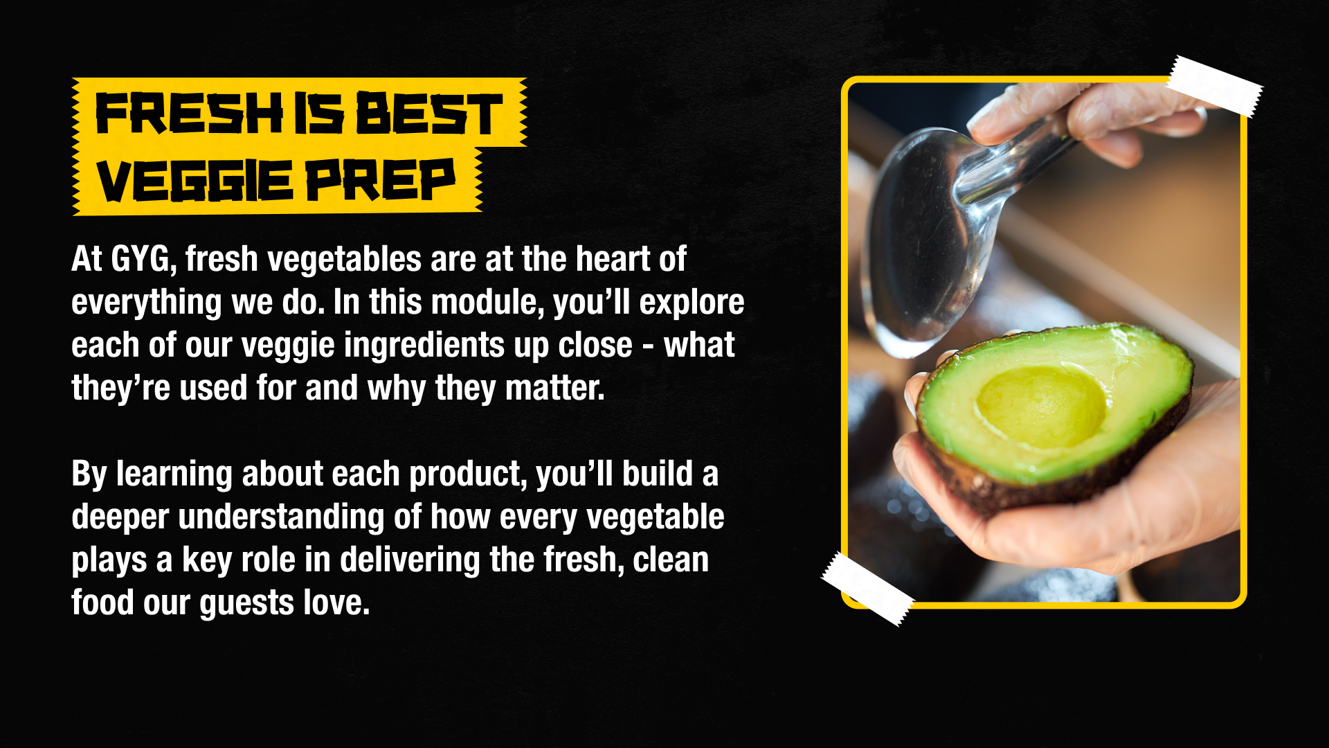
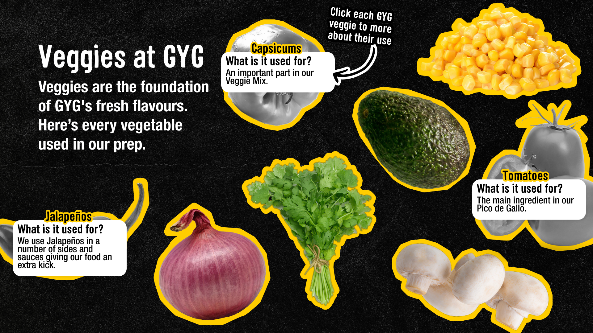
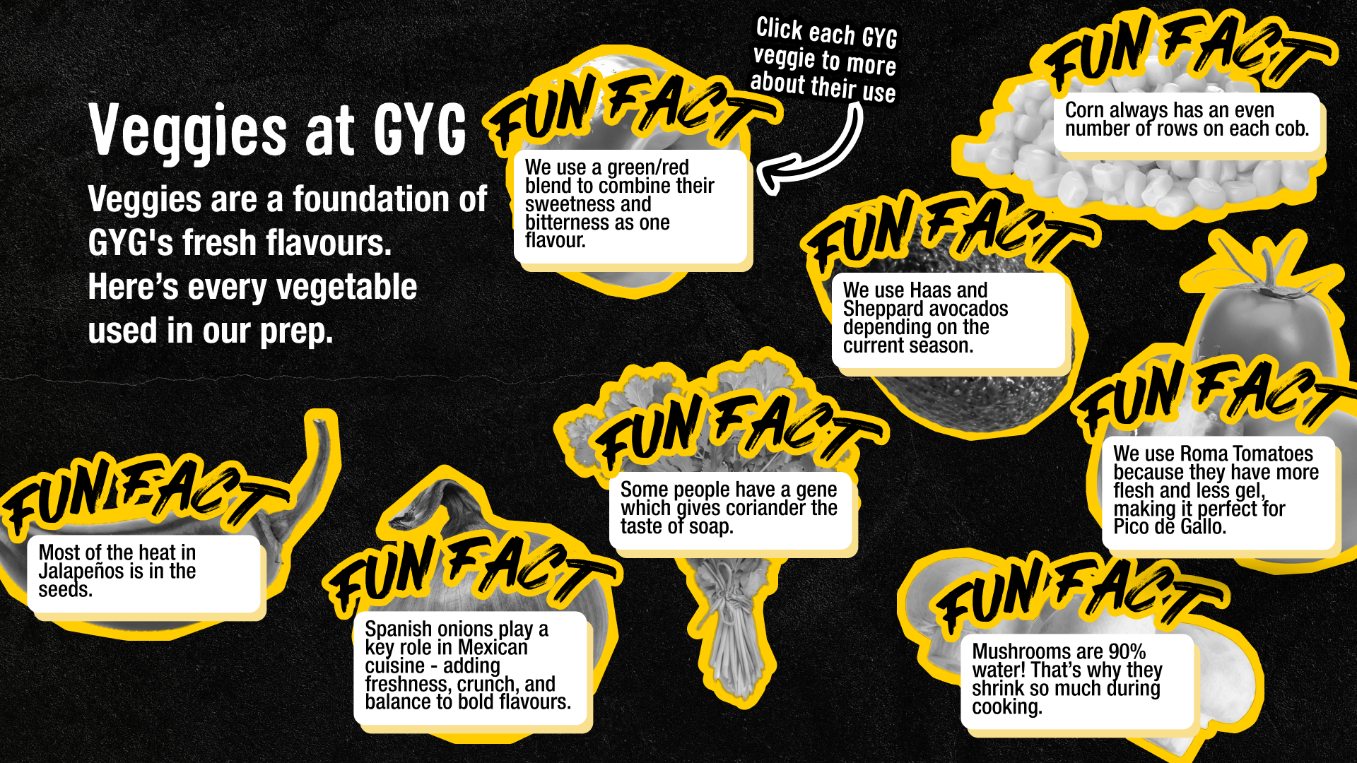
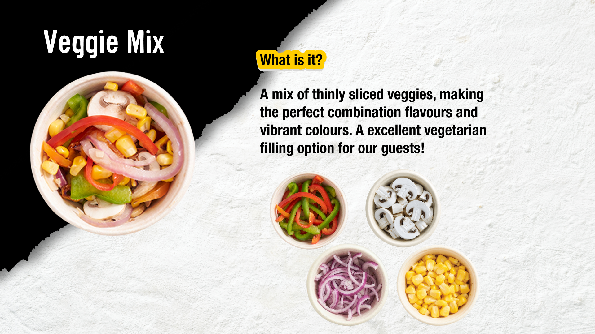
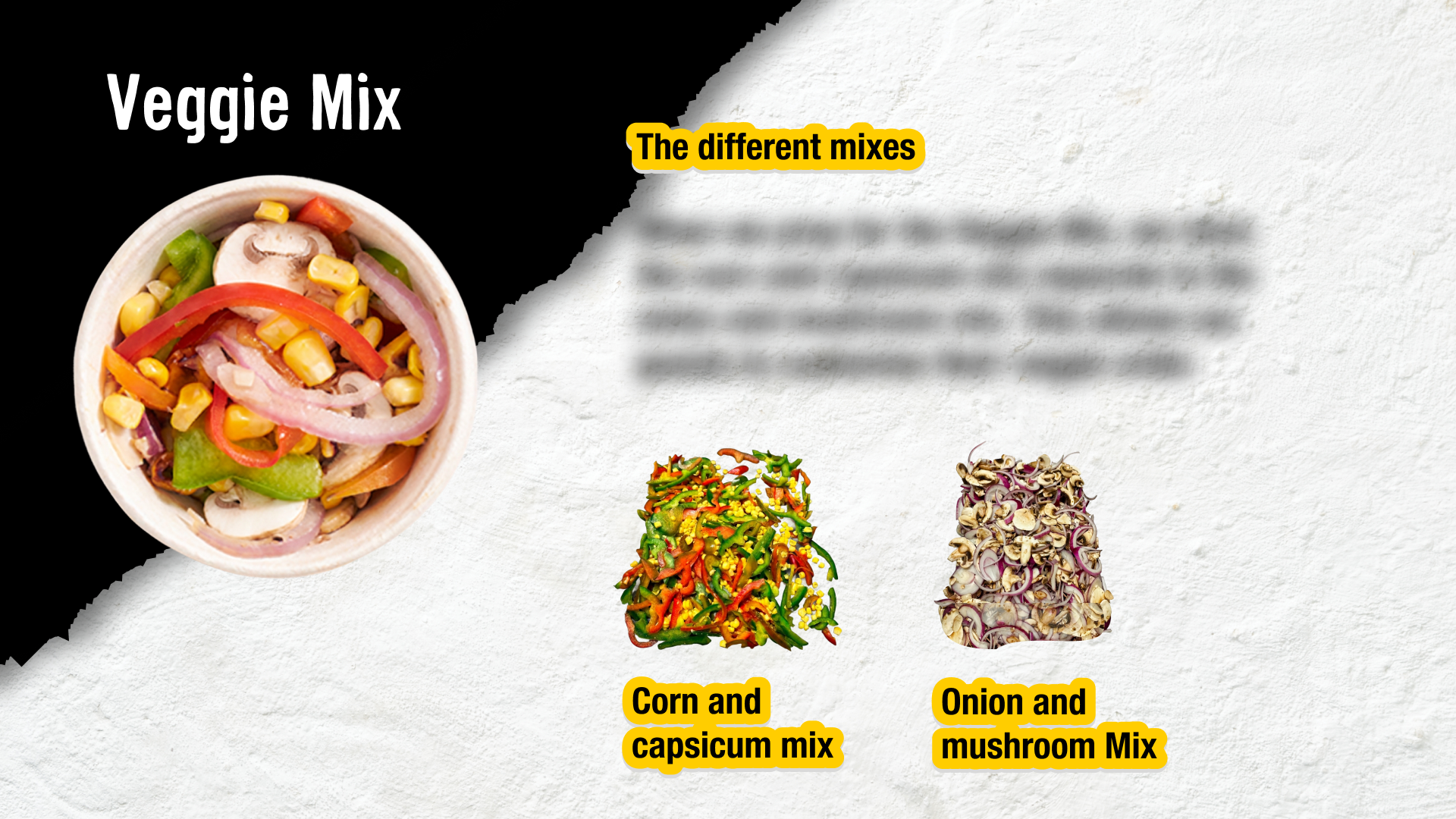
Veggie Prep
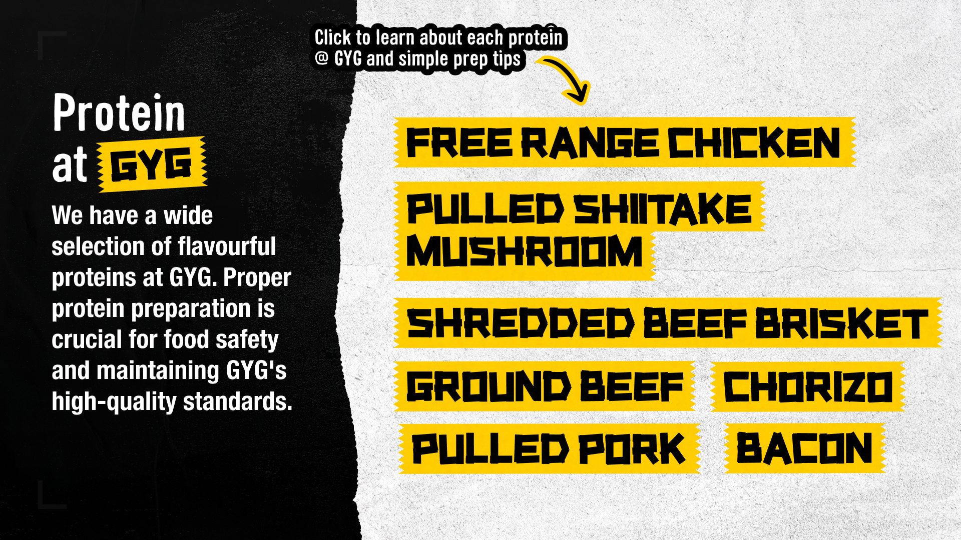
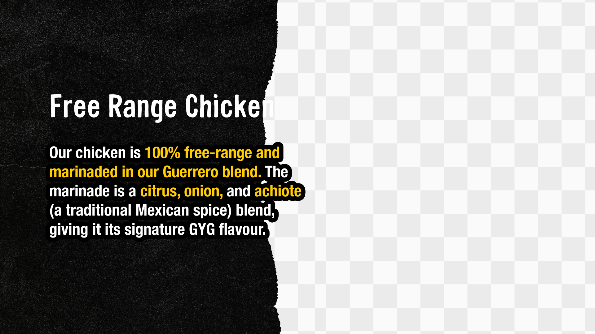
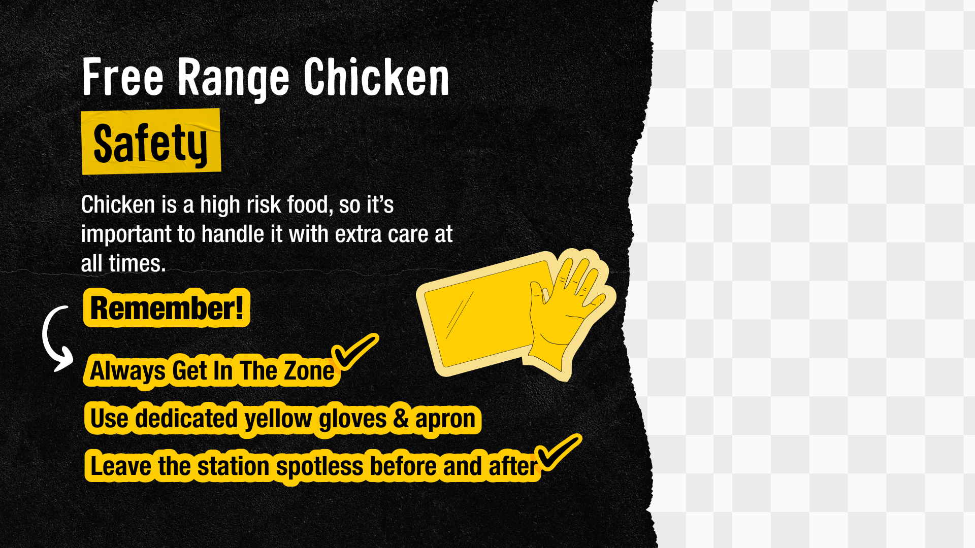
Protein Prep
Process
The project began with an audit of existing training modules — analysing how content was structured, where cognitive load was highest, and where the design was getting in the way of learning. A recurring issue was text overload: screens were dense with information that crews were unlikely to retain, and the visual design hadn't kept pace with GYG's current brand direction.
From there, I worked through a redesign focused on two things: stripping content back to the essential what and why, and modernising the visual presentation to feel more engaging and on-brand. I held stakeholder meetings with the training team throughout to pressure-test decisions and ensure the content remained operationally accurate.
A trial module was released before full production, allowing us to gather feedback and make refinements before rolling out the broader module set.